The Ultimate Guide to Responsive Email Design Best Practices
Imagine spending hours crafting the perfect email campaign. The copywriting is punchy, the graphics are stunning, and the offer is irresistible. You hit send. But when your subscriber opens it on their morning commute, the text is microscopic, the hero image is cut off, and the call-to-action button is hidden off-screen. They delete your email in less than two seconds.
This is the harsh reality of ignoring responsive email design. In this comprehensive guide, we cover everything you need to know.
What you'll learn: Fluid layouts, media queries, hybrid patterns, email client quirks, dark mode handling, and a pre-send checklist you can use on every campaign.
1 What is Responsive Email Design?
Responsive email design is the practice of building email templates that automatically adapt their layout, typography, and imagery to provide an optimal viewing experience across a wide range of devices and screen sizes.

The Data Behind the Design
- Mobile Dominance: Mobile clients account for over 41.6% of all email opens. Up to 85% of users access email via smartphones weekly.
- The Cost of Poor Design: If an email displays poorly on mobile, over 70% of users will delete it within three seconds.
- Incredible ROI: Email marketing boasts an average ROI of $36 for every $1 spent - but only if your audience can actually read it.
Key takeaway: Responsive design isn't just about aesthetics - it's about deliverability, accessibility, and revenue. A non-responsive email is a wasted email.
2 The Key Principles
Fluid Layouts
Use percentages instead of fixed pixels. Set a table's width to 100% with a maximum width, so it expands on large screens but shrinks for smaller ones.
<table width="100%" border="0" cellpadding="0" cellspacing="0"
       style="max-width: 600px; margin: 0 auto;">
  <tr>
    <td align="center" style="padding: 20px;">
      <!-- Your content goes here -->
    </td>
  </tr>
</table>
Scalable Images
Set the image's maximum width to 100% and let height adjust automatically. Keep the HTML width attribute as an Outlook fallback.
img.responsive-img {
  max-width: 100% !important;
  height: auto !important;
  display: block;
}
Media Queries
Apply specific styles only when certain conditions are met. This is the magic behind changing a two-column desktop layout into a single-column mobile layout.
@media screen and (max-width: 600px) {
  .column {
    width: 100% !important;
    display: block !important;
  }
  .body-text {
    font-size: 16px !important;
  }
}
3 Common Responsive Patterns
The Single-Column Layout
The safest pattern. A single column of text and images flows naturally down the page. Minimal media queries, renders beautifully everywhere. Ideal for newsletters and transactional emails.
The Multi-Column Stack
For e-commerce: show three products side-by-side on desktop, stack them vertically on mobile using media queries.
Hybrid / Spongy Development
Uses fluid widths so the email flexes naturally without media queries. "Ghost Tables" (Outlook conditional comments) lock the width for Microsoft clients.
<!--[if mso | IE]>
<table role="presentation" width="600" align="center">
<tr><td>
<![endif]-->

<div style="max-width: 600px; margin: 0 auto;">
  <!-- Fluid content -->
</div>

<!--[if mso | IE]>
</td></tr>
</table>
<![endif]-->Outlook warning: Microsoft Outlook for Windows uses the Word rendering engine. It does not support max-width, border-radius, Flexbox, or Grid. Always test with ghost tables.
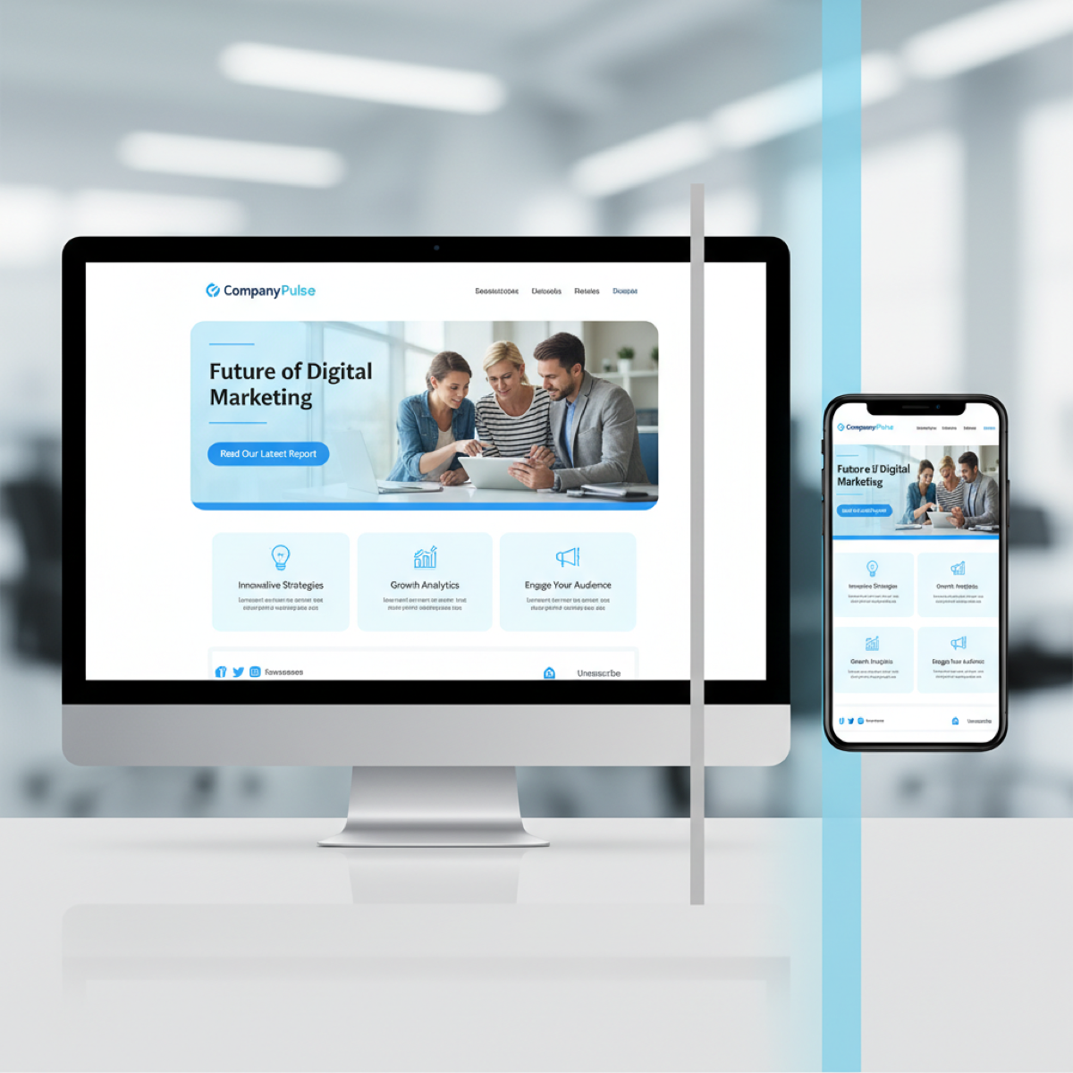
4 Mobile-First vs Desktop-First
Code Desktop-First because Outlook ignores media queries. Build a solid 600px table structure, then use max-width queries to adapt for mobile.
Design Mobile-First by asking these questions before every campaign:
- Is this subject line too long for a mobile screen?
- Is the hero image text legible on a 4-inch display?
- Is the CTA button easily tappable with a thumb (44x44px minimum)?
- Is the copy concise enough to prevent endless scrolling?
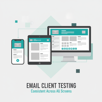
5 Testing Across Email Clients
Microsoft Outlook
Uses the Word rendering engine. No Flexbox, Grid, max-width, or border-radius. Use nested tables and VML for backgrounds.
Gmail
One CSS typo and Gmail strips your entire style block. Clips emails over 102KB. Auto-links phone numbers and addresses in blue.
Apple Mail
The golden child - uses WebKit, supports nearly all modern CSS including animations and @media queries.
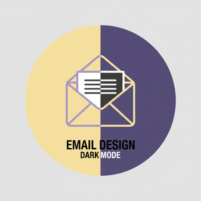
Dark Mode

Use transparent PNGs for logos, add white strokes around dark text in images, and define @media (prefers-color-scheme: dark) styles.
6 Mistakes to Avoid

- Image-Only Emails: Not responsive, not accessible. Many clients block images by default.
- Tiny CTAs: Minimum touch target is 44x44px. Build bulletproof buttons with HTML/CSS.
- Illegible Fonts: Never below 14px. Aim for 16-18px on mobile.
- Missing ALT Text: If images fail to load, ALT text is all the user sees.
- No Preheader: Without it, clients pull "View in browser" or "Unsubscribe" as the preview.
7 The Ultimate Checklist

- Layout: Fluid tables with percentage widths and
max-width - Outlook: MSO conditional ghost tables for Windows desktop
- Images:
max-width: 100%,height: auto, descriptive ALT text - Typography: Body copy at least 14px (preferably 16px)
- CTAs: HTML/CSS bulletproof buttons, at least 44x44px
- CSS Inlining: Critical styles inlined for clients that strip style blocks
- File Size: Under 102KB to prevent Gmail clipping
- Dark Mode: Transparent logos, tested color inversions
- Previewed: Tested in Outlook, Gmail, Apple Mail, and Yahoo
Stop Wrestling With Broken Code
MiN8T's drag-and-drop editor automatically generates bulletproof, responsive HTML. Fluid tables, media queries, Outlook ghost tables, CSS inlining - all handled for you.
Start Building for Free